


Mobile Run App
UI / UX Icon, Color Scheme Design
Research & Development
Murray State University Project

Building a better user experience
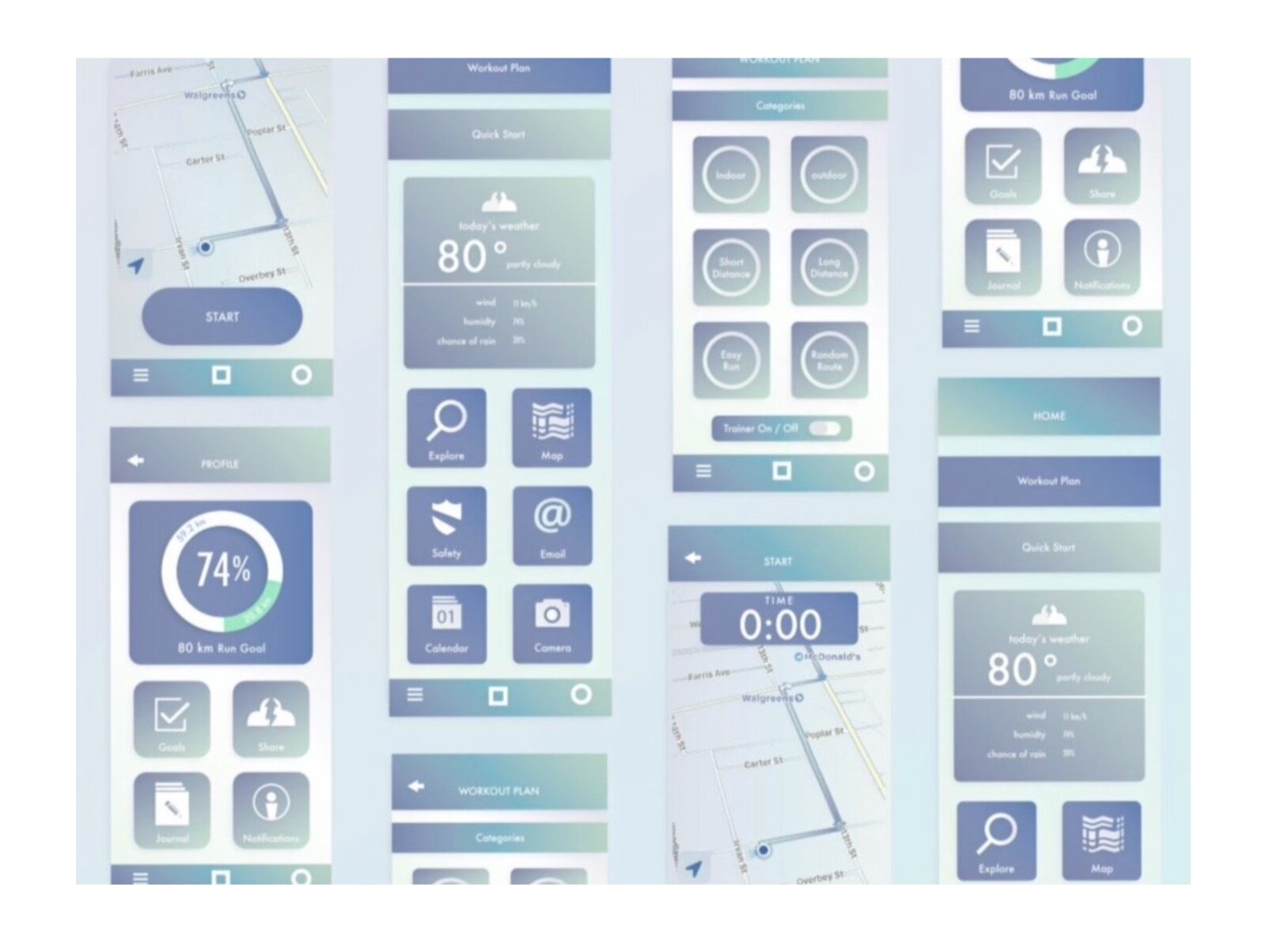
I got the opportunity to design this app for a class project. The goal was to research the target users and build a run app suitable for a wide range of users. After analyzing quantitative and qualitative research I could begin with the visual design of the app. A challenge of this project was designing in a mobile environment and making sure that it maintained responsiveness and functioned effectively on any size screen. I also designed a whole new icon set and custom color palette for the app. I used a combination of Photoshop, Illustrator, InDesign, and Adobe XD.


Creating great mobile interfaces that work for everyone.
The design process for this mobile app involved flowcharting, target audience analysis, and content organization. Understanding the exact needs of your audience through research helps to design the best product. I focused on understanding trending UI / UX concepts as well as using an interface that is based on human perception principles. The ability to spot and catch up to current trends is key while designing mobile apps in order to stay relevant.
I have designed this mobile app for any user wanting more out of the fitness applications on their phone. This app is meant to be used by runners that want to track their running progress. The colors are bright and friendly. The icons are custom designed to match the vibe of the rest of the mobile app design. I have also incorporated a small amount of texture in some areas to add a bit of depth to certain pages. The typography is bold and readable with a slight curve on it to better match the curves in the other areas of the design.
